TripMap
Plan with fun & Discover for real


Role
UX Designer
UX Researcher
Tool
Sketch, Figma, Principle, InVision, Illustrator, Procreate
Timeline
March - April 2020
Refined in June 2020
OVERVIEW
Travel abroad is an amazing way to explore the world, enjoy the pleasure, and relax from heavy work.
However, have you ever met such situations?
It took lots of time and effort to explore your destination.
It was hard to decide where to visit and eat by relying only on the customer reviews.
It was frustrating to plan a personalized and satisfying travel route.
it was tiring to visit multiple places in a day without a good navigation route.
You had no idea about how to share your experience with friends or people in the world.


So, how did you deal with these situations?
You searched a sea of websites to gather information, wrote down or saved your interested places and restaurants on the paper or on different applications, checked the fast route one-by-one on the map…

Still feel lots of work to be done.
But now, your travel buddy “TripMap” is here to help.

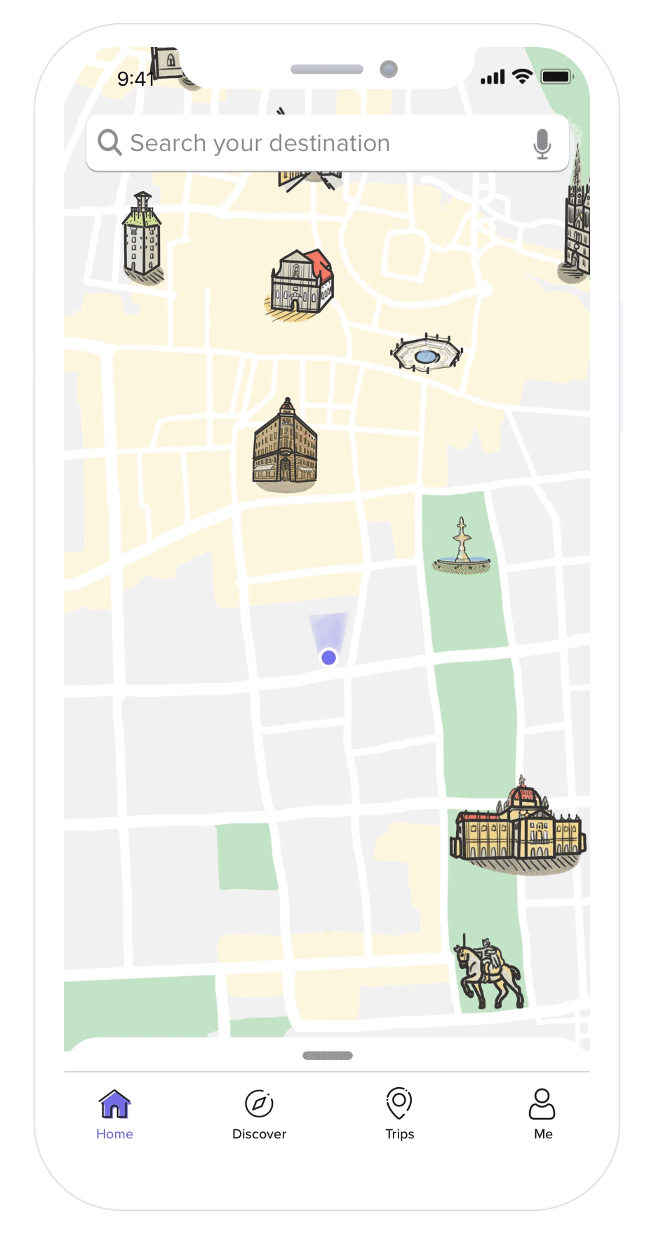
Visualize Attractions on the Map
Iconic attractions on the map for better visualization
The map shows the main iconic attractions in your destination area and provides suggestions on the most popular attractions that match your preferences. Besides, TripMap also offers recommendations for restaurants and displays them on the map so you can have a better understanding of its location and other information. You can easily save your interested or want-to-go places while exploring destinations, which can help you plan trips later.
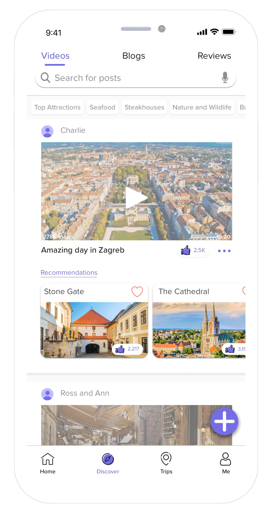
Discover World with Others
Discover places via real experiences on videos,
blogs, and reviews
You can discover your destinations through videos (imbed from other platforms and uploaded by users), blogs, and reviews from other people. These recorded experiences present you with a live scene that better helps you make decisions on where to visit and eat.


Plan Your Itinerary
Plan your day-by-day itinerary based on your interested places
After saving your favorite places, you can easily make your plan according to your location or personal schedule. It provides a shopping-like feature, and you can add your interested places on the map in the sliding card, which will display estimated time in terms of added items.
Navigate Multiple Stops
Navigate your plan directly with an proposed route
When you start your journey, it can navigate your multiple stops to plan the most convenient way to save your time and effort while visiting attractions. It can also automatically reorder your stops according to the real-time situations.
Share Impression
Share your experience and impression with friends and others who can benefit from it.
Since you planned the itinerary and have a record on it, it is easy to share it with your friends. Even more, if you have something to say along with your experience, you are very welcome to upload to the blog to let other people see it.

Design Process

Research
EMPATHY INTERVIEW & MAP
Understand People’s Thoughts, Behavior, and Needs While
Traveling Abroad
The entire travel experience is complicated so that it is hard to deal with all issues. Since many platforms solved reservation-related things very well, like booking hotels or flight tickets, this project does not consider them. I interviewed four people who have several experiences traveling abroad and asked them about their experience and expectations mostly with open-ended questions.


PERSONAS
Identify Whom the Design is for
To better develop design solutions based on users' needs and goals, I synthesized the empathy interview results and came up with the following personas:

COMPARATIVE ANALYSIS
Understand What Problems are Solved Well or Not Well on Different Platforms

So What are limitations Here?
It seems that some issues cannot be solved very well on the above platforms.
-
Cannot help plot routes based on personal choice;
-
Cannot create customized maps to help navigate multiple places with ease and share with friends;
-
Lack of reliable reviews and recommendations to help make a decision;
-
Lack of filters to check reviews based on an individual needs;
-
Cannot help share travel experience with others.
PAIN POINTS AND USER NEEDS
Have a Good Understanding of Users’ Needs to Make Good Design Decisions.
I concluded six pain points based on interview insights and vacancies in the travel market.

People care about attractions and food the most while traveling
One of the goals of people traveling abroad is to experience different cultures, which is mainly manifested in natural scenery, cultural architectures, and gastronomy. Therefore, people usually pay attention to where to visit and eat to fulfill their purpose of travel.

Planning a personalized itinerary takes time and effort
People usually have a rough plan for traveling abroad, and due to time limitations, they have to choose their visit places carefully and make a day-to-day schedule. It always takes a lot of time and effort to prepare because people are not familiar with their destinations and need to make many decisions.

There is no good customized map to plan the best travel route, which harms travel experience.
There are plenty of great navigation tools. However, people would visit several places on the same day and have to check routes manually to decide a relatively convenient way to reduce time and effort consumptions.

With less reliability, the reviews only is not enough to convince people to make decisions.
Most people believe that the high-ranking reviews are sponsored so that they do not trust them very much. Some people would rely on recommendations from Internet-influencers or friends who really tasted and took a video shot showing the food. In fact, people are more willing to trust what they see (videos, images) instead of what they read.

Want-to-know travel information is hard to get in one platform.
Most people would search and check the information across several platforms, such as emergency numbers, weather, student tickets, transportations, religious taboo, even whether receiving credit cards at a parking lot, etc., that are usually not coherently provided in one platform.

Hard to share the entire experience with friends who ask for suggestions.
Few people would record their entire experience through a blog. Most people’s memory will fade away as time goes by. However, when some friends want to ask for suggestions, it is tough to recall memories and tell them detailed schedules.
IDEATION

BRAINSTORM
What are the Primary Problems?
Here I visualized in a graph what the interviewees said and felt to help me better understand problems.
Then I realized:
In the beginning, it is tough to make a plan based on personal preferences. During travel, people usually do not know a convenient way to visit, and after travel, people find that it is not easy to share their experience with people.
Information overload and lack of reliable reviews make it hard for people to make decisions on where to visit and where to eat.

What are the Design Opportunities?
SKETCH
Sketch Novel Ideas Based on User Needs


Pick An Idea
Save Your Places
My original idea was to let users choose their interested places and save them by checking marks. It seems more comfortable for users to be able to make choices. However, in fact, one city has lots of attractions that cannot be displayed and chosen at one time, especially I am making a mobile version. Besides, according to Jakob’s law, users spend most of their time on other sites, which means that users prefer that the new app can work the same way as all other sites they already know. The second way is the sliding card below, and its corresponding point will stand out on the map, which has been used by most platforms.
Day-by-day plan
Though the second idea displays all saved places as tags, which has clear visual expressing, it doesn't tell users what to do next. Instead, the first idea only shows the names line by line, but it has an "add" button along with each name , which indicates actions next. Compared to the other idea, the first idea seems to work better because it directly informs users' next activities which can be easily understood by users, even if it does not have a very impressive visual picture.
DESIGN
WIREFRAME
Define Structure to Layout Page Content and Functionality


FEATURE FLOW
Define A Series of Path to Achieve Meaningful Goals

PAPER PROTOTYPES
Usability Testing on the Initial Design Ideas
The goal for paper prototypes:
-
Express initial design solutions and see if they match users’ needs’;
-
Observe user interactions with the interface and see if there are problems during the entire process.
.png)
User feedback and main problems
-
Easier to save their favorite attractions and restaurants based on preferences;
-
Have personalized choices and routes;
-
Better make decisions on living, eating, and visiting.


Since there are several main features and many interactions, it is hard to display all of them in paper prototyping, making it difficult for users to understand the entire process. One user mentioned that higher fidelity prototypes might have a precise delivery of user flow.
Even though each iconic image also aligns with text, yet, users still felt that these icons are not very intuitive for them. They would be confused about them while all saved places displayed on the map.
The “Discover” feature embeds other platforms resources, such as Youtube, Instagram, Blogs websites, offering more popular resources to aid users in making decisions. However, a product needs to have its user group, and it should also create its own resources. Therefore, this product should allow users to be sharers to upload their videos and blogs while traveling, making it become a personalized travel platform.
Complicated User Flow
Not Intuitive on Icons
Questions on Resources
HIGH-FIDELITY PROTOTYPES
Refine Previous Problems and Conduct Usability Testing Again to Check If Design Meets User’s Expectations.
For this iteration, the primary goal is to validate whether the current design matches the user needs: having a personalized itinerary, helping better learn about their destination and plans, helping them make decisions based on recommendations, sharing the experience with others, improving travel experience. In addition, flaws in interaction and interface should also be spotted.
ONBOARDING


HOME


DISCOVER


TRIP


PROFILE


NAVIGATE


REFINE
EVALUATE USABILITY TESTS
Collect User Feedback in both Quantitative and Qualitative Approaches
I moderated user feedback sessions with 5 users who have a similar frustrating experience with personas. To qualitatively measure the design, I asked users to think aloud while using the application. I then asked several follow-up questions to see if the current design matches their needs, and their thoughts about design including features, interaction, and interface. To quantitatively measure the design, I broke down user needs into detailed measurable goals, and developed a questionnaire to gather answers.

Usability Tests Results
I collected comparatively positive results from the questionnaire, which moderately help users achieve their goals and match their needs during tests. Here is a summary of how people rate their experience in learning about destinations, making decisions about want-to-go places, keeping records of interested places, checking information, proposing routes for multi-stops, and sharing with friends and the public.

In addition, 5 out of 5 users expressed that their favorite features are “plan trips” and “navigate multi-stops.” The former one helps them better learn about destinations and plan convenient routes ahead of time. The latter aids them with a navigation proposal saving effort spending on the way.
5 out of 5 users said that visualized attractions on the map could help them better learn about destinations, plan a personalized route more convenient, and make decisions on places where to visit, eat, and stay(the roughly staying area).
3 out of 5 users expressed that they feel not comfortable about uploading or sharing their travel experience to the public, but they would like to share with their friends.
Usability Tests Feedback
To have a better understanding of user concerns and thoughts, I used sticky notes again to organize each user’s feedback and grouped them by feature, interface, and interaction.

(Different colored sticky notes represent feedback from different users)
DESIGN ITERATION
Refine Design with Collecting Feedback and Founding Flaws
I moderated user feedback sessions with 5 users who have a similar frustrating experience with personas. To qualitatively measure the design, I asked users to think aloud while using the application. I then asked several follow-up questions to see if the current design matches their needs, and their thoughts about design including features, interaction, and interface. To quantitatively measure the design, I broke down user needs into detailed measurable goals, and developed a questionnaire to gather answers.
Home page: interaction, layout, and icon.
Since the hi-fi prototypes have a fixed user flow and limited interaction, users cannot feel the entire interaction. Mainly, they felt that there was a lack of correspondences between the sliding cards and items on the map. Besides, the attractions and restaurants have a different sliding card layout, which increased the difficulty level for users to recognize. My original idea was that restaurants should have some tags with relevant information, like cuisine style and prices, and attractions need only show images for easy recognition. However, users prefer to see a consistent and straightforward layout, and also care about its popularity, business hour, and ticket information. Thus, I would unify the design to keep the same consistency with vital tags. Last, users responded that the saved restaurants were not easy to identify on the maps because of a similar logo appearance and color, which was supposed to be avoided before tests. According to user feedback and problem identification, I made refinements on the home page as below:
BEFORE
AFTER

BEFORE
AFTER

BEFORE
AFTER

Discover page: some flaws.
Most users thought that videos and blogs are capable of offering more useful travel guiding resources than reviews do because they give more direct information and better help users make decisions. On the “Discover” page, users would feel confused about the recommendation section at the beginning. I intended to offer suggestions to let users save places that they are interested in for later planning. However, due to limited interaction between users and prototypes in tests, users cannot understand the relation between the recommendation section and the main content very well at first glance. Three users mentioned that they would also like to save other’s useful blogs and follow their routes. It not only saves planning time and effort but also experiences the same interesting places as well. Based on user feedback, I made some changes to make recommendations more intuitive and let users save their liked blogs.
BEFORE
AFTER

BEFORE
AFTER

Trips page: display estimated trip time and directly navigate from here
All users mentioned that they like “planning trips” feature, and adding places on the map could mostly help them arrange a daily plan, like distance, location, time, etc. For this feature, most users expected to see an estimated time when they plan to visit several places in one day. And also, if they can navigate this plan and view routes on the map, it could help them better make a satisfying plan. According to users’ requirements, I added two more features on the trips page.
BEFORE
AFTER

“Share experience to public” feature: not very obvious.
Users could easily understand where to share their experiences with friends, and they would like to do it if their friends ask for suggestions. However, the choice of sharing to the public was not very obvious in the previous design. Moreover, the hard-to-find share button would reduce the initiative of users to make trips public. Thus, I added an “Add” button on the discover page to let users know that they could upload something they would like to share with others.
BEFORE
AFTER

Trade-Off
Sharing experience is not an individual feature.
A user-oriented product should have a clear business value that is attracting and retaining most users. Uploading personal experience to the platform could bring more reliable resources and also help improve customer loyalty to the product. However, most users who took usability test felt not very comfortable to share their experience. Also, I want to highlight that this product could help users better learn about the destination and plan a convenient route, instead of a sharing-focused platform. Therefore, I didn’t put sharing experience as an individual feature. Alternatively, if this product would be delivered to the industry market, it can consider sharing experience as its main feature to improve customer stickiness.
Some functions are hard or expensive to accomplish.
One of my crazy idea about the “Discover” part is to extract places, including attractions and restaurants, and display under each video and blogs so that users can easily save their favorite places directly. Before I made paper prototypes, I asked two friends who are developers, they both told me it was expensive to accurately extract the exact words from blogs, let alone extracting voice from videos. Thus, I just let users save recommendations they like, which is a common feature that most platform uses. Besides, some users even mentioned that they hope that the app could automatically plan their whole trip by reading through their collected resources from others. However, it is not possible to do that for now. So I just added a button to let users save their liked blogs that can be found in the profile section.
FINAL DESIGN

REFLECTION
NEXT STEP
If given more time, I would like to think more about:
How to engage more users?
Besides what I mentioned in the trade-off, I think building a community is also an excellent way to engage more users. Users can ask for some travel tips or suggestions from each other so that they would be a regular user or experienced user in this platform.
Another idea is about generating a footprint report for users, such as telling them how many cities they visited this year, one restaurant that you ate before has become the most popular one, etc., which can build emotional connections with users.
For pre-travel, if it is better to explore on a web platform?
In the sketch, I have two ideas about saving your favorite places, one of which uses check marks to choose on the map, and another uses a sliding card. The main reason that I chose the second one was that it was troublesome for users to move their fingers around to browse on the phone. Nevertheless, if it is on a web platform, choosing places directly on the map could show its location. And it can also estimate time and plan your trip at once, which seems more convenient. However, if it is better to explore on a web platform, I still need usability testing to answer it.
WHAT I LEARNED FROM THIS PROJECT
Keep an open mind and follow the law of design.
Each stage should do what each stage is supposed to do. I should brainstorm as many ideas as possible during the ideation stage to solve the problem, and then later, I should follow the design law to check if each idea is valid and whether or not it can be delivered. So do not limit yourself with ideas and then optimize your design decisions by following the law.
Understand the rationale for design decision making
Every time I make a design decision, I should ask myself what influences this decision would make, and I must answer it. It can be design laws, user requirements, and other possible reasons. This process can help me build a better product and more likely to succeed.
Pay attention to interface design
Interface design is also important. It can mainly improve the visual effect on design. In this project, I followed the human interface guidelines to create buttons, sizes, and white space, which makes my designs seem more professional.
