
Design Assessment


Dark Mode


Role
Designer
Researcher
Tool
Sketch, Principle, InVision, Illustrator, Photoshop
Timeline
40 Hours
Design Goal
Enable customers to visualize how well their investment portfolio is performing, including gains and losses.
OVERVIEW
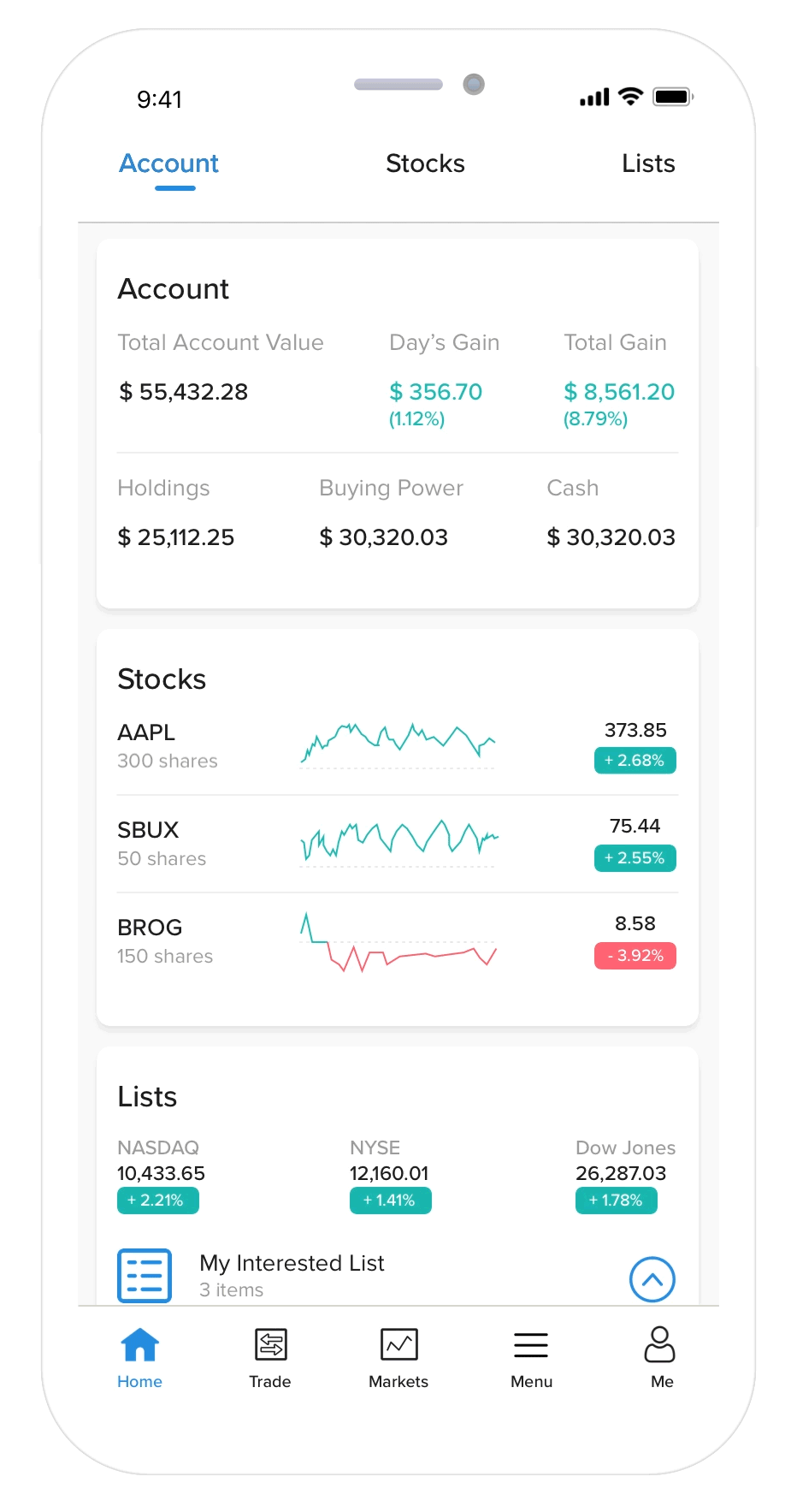
Visualize the Most Cared Information
Display necessary account information, investing stock status, and interested stock status
The “home” page is mainly showing want-to-know information for customers to skim quickly. It has been divided into three sections: account, stock, and list. Customers can swipe up and down to see this information. The section would be automatically shifted by swiping down, which can deliver more smooth interaction for use.
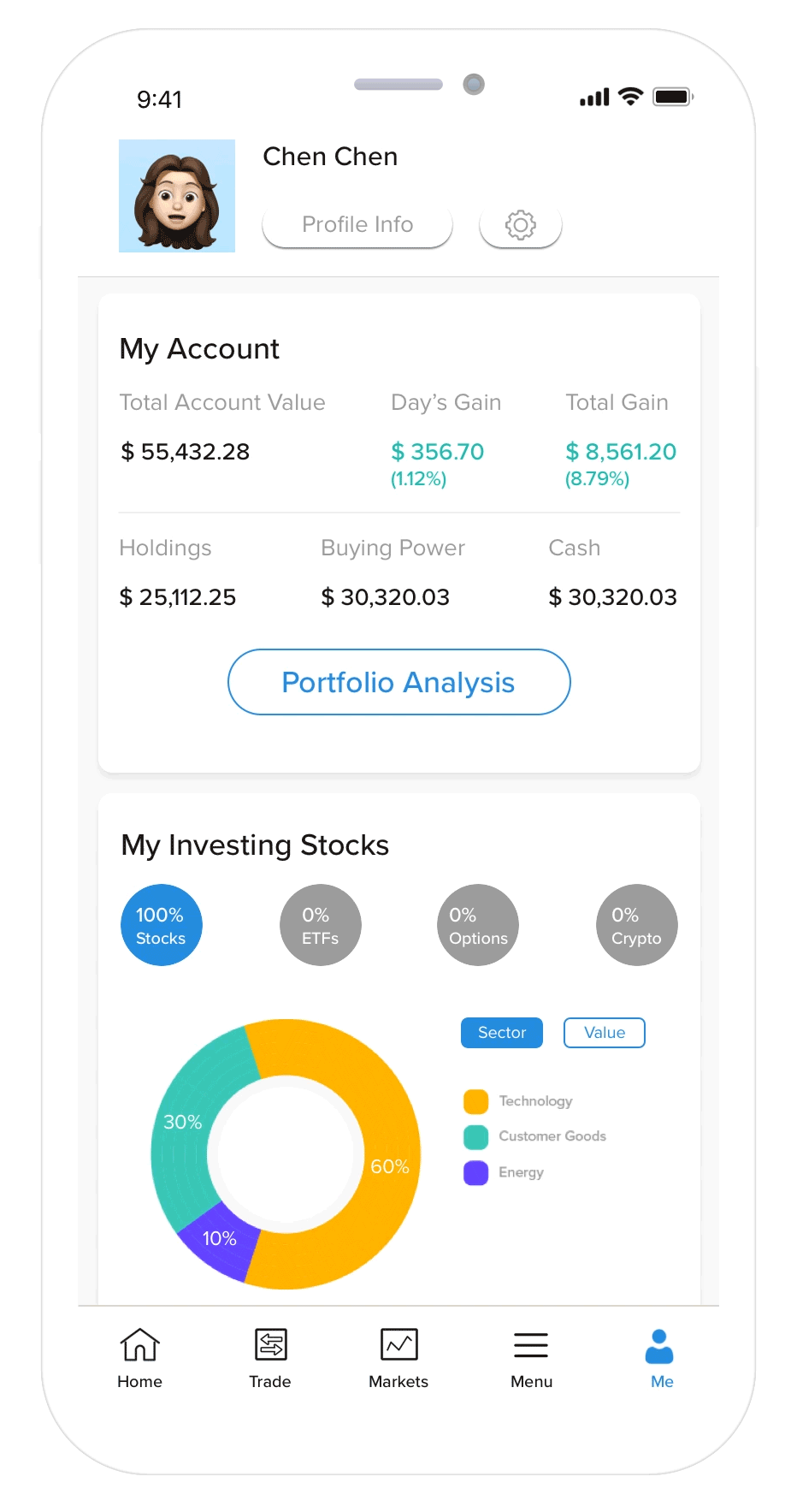
Visualize Personal Account Information
Display the overview of investment and interested stocks summary
The “Me” page is a collection of all investment and interested stock information. For example, how their investment distributes and what categories they focus more. It also provides detailed portfolio analysis and market analysis for customers to understand and evaluate their investment decisions and the current market performance.
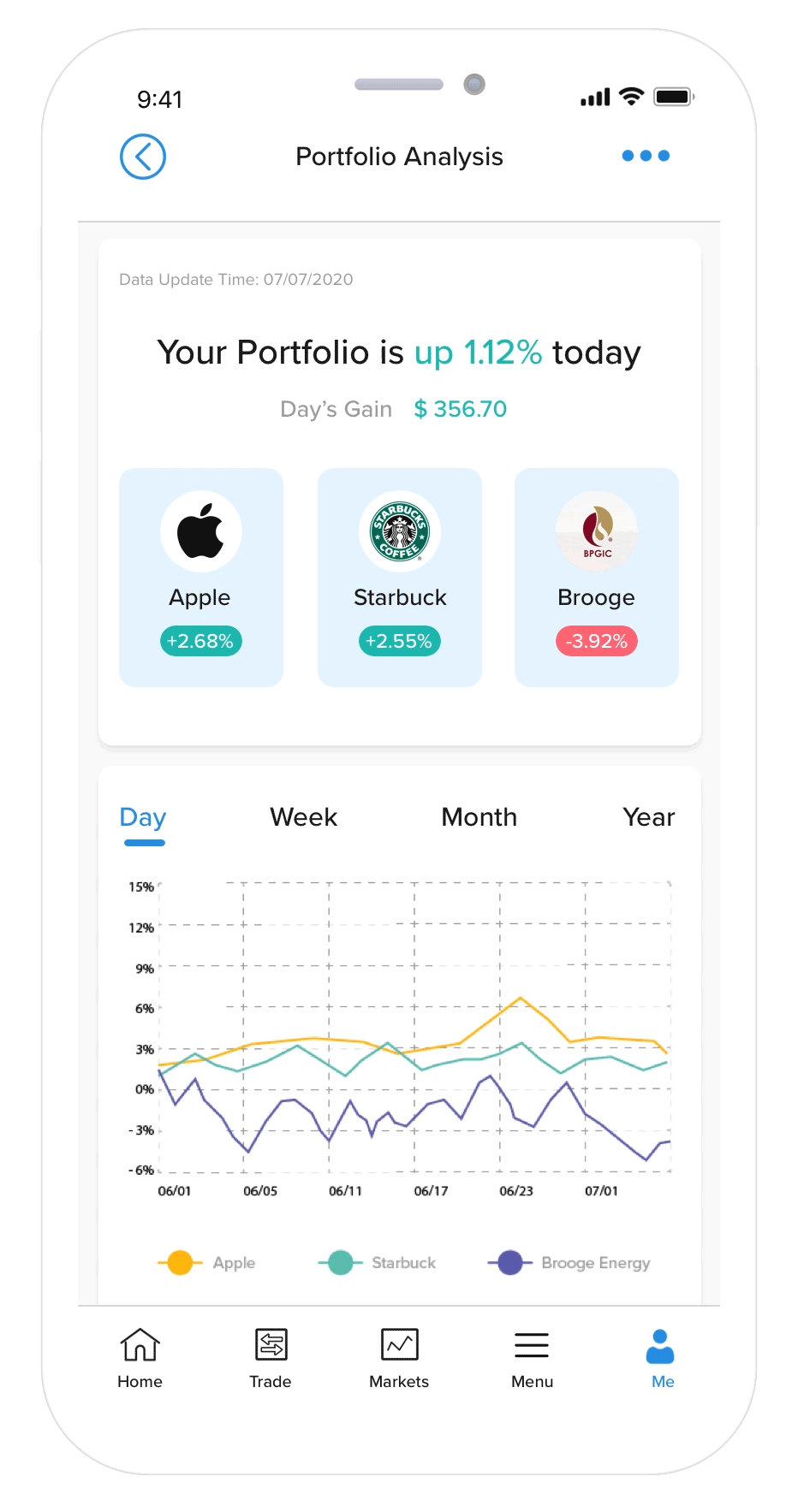
Visualize Portfolio Analysis
Display detailed trends of investment and gain and loss sources
The “portfolio analysis” page displays an analysis of portfolio performance. Customers can browse more detailed information about their investments, meanwhile, they can view their gains and losses categorically.
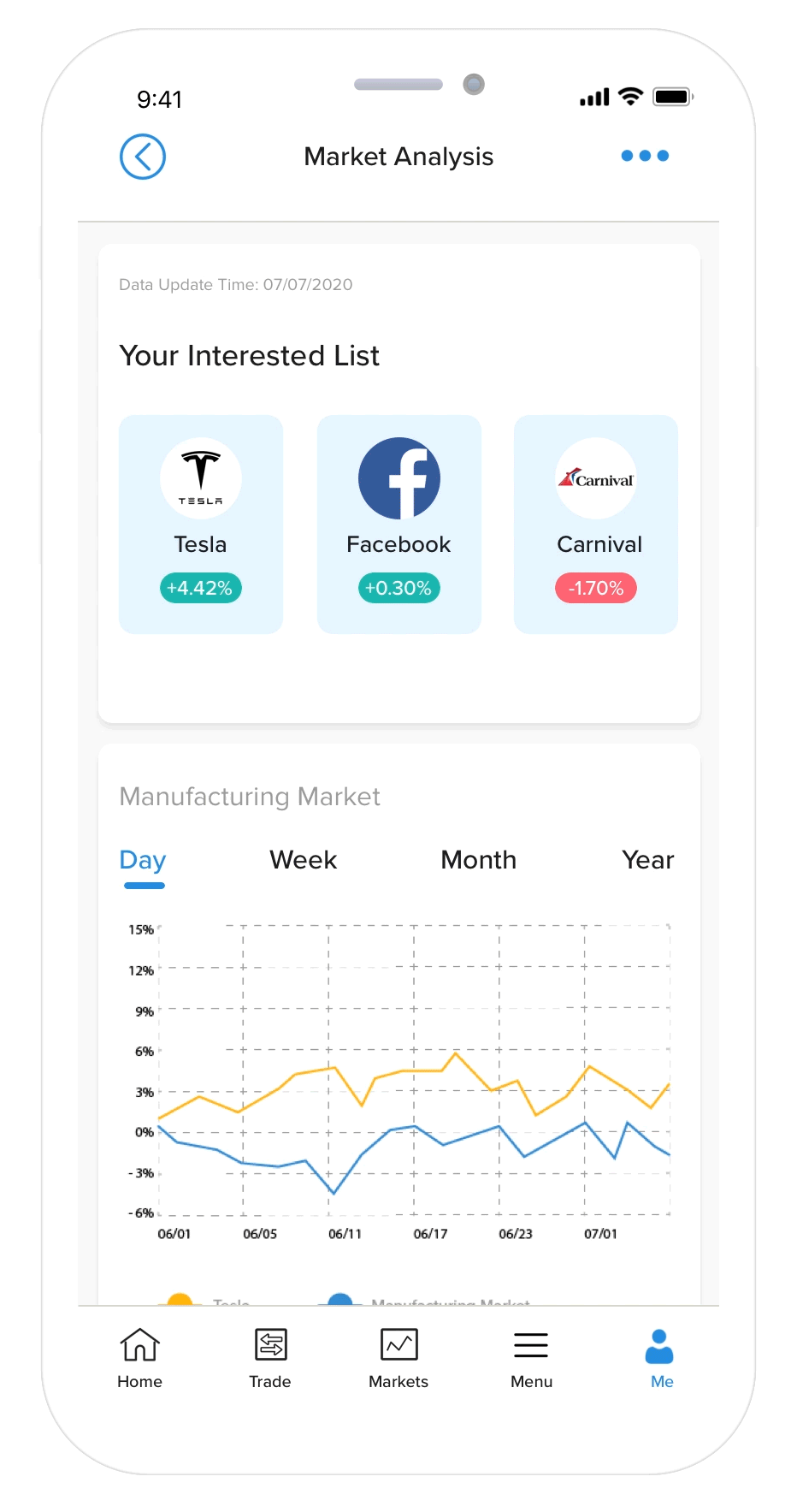
Visualize Market Analysis
Categorically display interested market trends
The “market analysis” page visualizes a summary for each category that the customer is interested at. In detail, each summary presents the trend of the corresponding market category as well as that of the items belonging to the category interested by customers. And also, at the bottom of each visualized summary, a clean and simple note highlighted by different colors would help customers understand and compare their interested items to the general market level on average.
Research
I had little experience in investment, therefore I researched to study the workflow of customer investment behavior by browsing multiple popular personal investment applications, including Robinhood, Stock, Webull, E*TRADE, TD Ameritrade and Yahoo Finance. My main focuses were on interface and interaction design in those apps. To facilitate my design, I further visualized this information in paper sketches.


Empathize with customers
After figuring out the essential functionalities in current investing tools, I sketched an empathy map showing how a customer Tom checks his portfolio effectively and effectively.

Assumptions
The following assumptions were made by researching and empathizing with customers.
-
Customers want to have an overview of important account information so that they can decide on the next steps. (e.g., profits, buying power);
-
Customers wish to see the information that they care about most with ease, such as current investing status and interested investment items;
-
Customers expect to see how their investments distribute;
-
Customers want to see a portfolio analysis about how their current decision performs.
IDEATION
Application Requirements
Based on the goal and assumptions, the app should be:
Reliable
-
Display accurate data and information.
-
Be transparent about the investing status.
Usable
-
Meet customer goals and requirements.
-
Display important information first.
-
Have a proper visual hierarchy to help customers understand different types of information.
-
Priorities
An investment portfolio includes plenty of information, and for each customer, they also have priorities to check different details. For this project, based on the empathy map, I hypothesized that customers want to see:
-
Overview of account information
-
Current investment status
-
Interested investment items
-
Portfolio Analysis
New idea (better visual design for potential inventments)
From research and design requirements, portfolio summary and analysis seem to be essential elements for customers. However, one limitation of the current apps is that they are all focusing on displaying the current portfolio performance. For example, there is no market analysis to tell customers how their interested stock performs on the current market. I hypothesize that helping customers to understand their the markets they are interested in will have a positive impact on how they choose their next steps. Such functionality could deliver vital information and give customers more prospective investment-related information. Therefore I added a new feature for interested stock summary and market analysis.
Note: this was my original idea and has no further research or usability testing. For real-world product design, this design decision should be made on data research and customer testing.

DESIGN
Wireframe
Thinking back about customers’ want-to-see information as a priority, I sketched a wireframe with some design ideas.

High-Fidelity Prototypes
HOME
ME
PORTFOLIO ANALYSIS
MARKET ANALYSIS


Interactive Prototypes
Constraints
Visualization of market analysis
The visualization is currently illustrated by average measure. It is possible that outliers(e.g, extremely high or low stock items) may affect the decisions of customers. Therefore, it would be more statistically important to incorporate standard deviations on the line plots.
Push notifications
In the empathy map, there was an act of receiving notifications of daily gain after hours. It was also a good idea to help customers learn about their investment at a glance at it. However, due to time constraints, this idea was not accomplished.
Visual design

