

SHOPEE APP CRITIQUE & REFINE


Role
Designer
Researcher
Tool
Sketch, Principle,
Illustrator.
Timeline
2 Days
Design Task
Find the most critical UX issue from the current Shopee app. Explain how you would go about identifying the issues and provide solutions for it.
Design Process

Research
Empathize with customers
Even though I have little experience in Shopee App, I still sketch an empathy map to understand the basic process for shopping online, and have these steps in my mind to further learn about users' behaviors.

Observation
I conducted three observational studies and follow-up interviews to understand user behavior and performance while they were using Shopee App.
Heuristic Evaluation
After I got some insights from interviewees and my personal experience of using it, I asked myself several questions to evaluate this app based on Nielsen's Uasiabulity Heuristics

What do The Problems Look Like On The Current App


Competitive Analaysis
I chose Shopee's direct competitor: Lazada, and also several eCommerce products to understand benefits and drawbacks across different platforms. Also, learn about how can I generate good solutions based on research from different platforms.

IDEATION & DESIGN
Wireframe
Before I created wireframes, I sketch on paper to outline the basic structure and layout of the interface along with some ideas.


Low-Fidelity Prototypes
I used paper to mock up my ideal redesign and focused on solving problems that I learned from research. And tried to create a clear hierarchy, and organized structure of the interface, display user-centered information and help users make decisions with more data.

High-Fidelity Prototypes
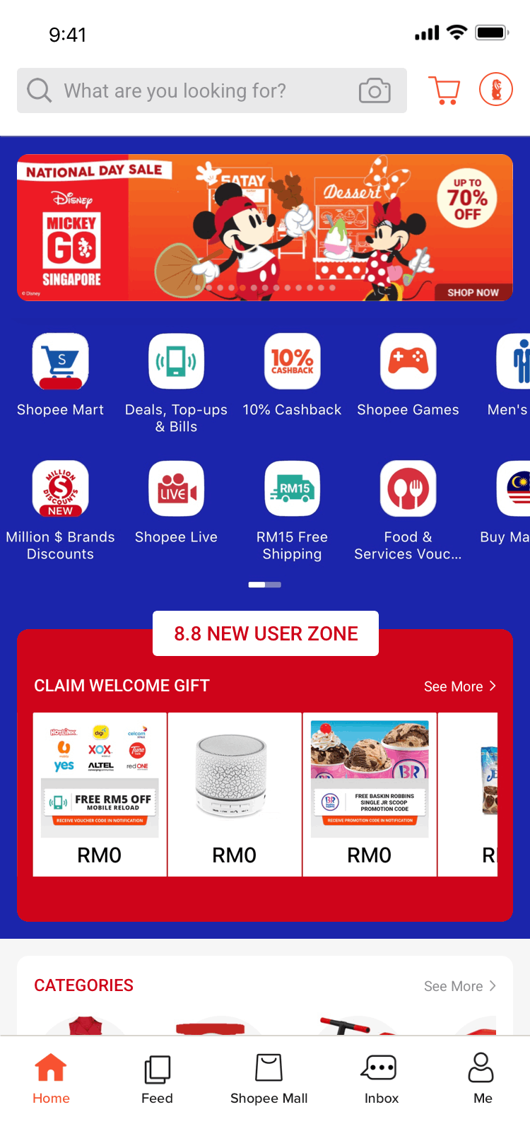
HOME
PORTFOLIO ANALYSIS

SEARCH RESULT

DETAIL PAGE OF ITEM
CHECKOUT


COMPARE SIMILAR PRODUCTS

Final Deliver

Improve Visual Hierarchy
Reorganize structure and diminish information redundant.

Micro-Corrections
Remove unnecessary information, and refine alignment on each item description to make a consistent interface.

Priority of Decision Factors
Based on users opinions of what will make them buy a item to place their most cared info at the first: price, shipping, reviews, rating, details.

Help Make Better Decisions
Add a new feature of "Compare Similar Product " so that users do not have to save every candidate in shopping cart before making purchases.
