
What I Learned From Orienter
This was a design challenge in a week so that there was not enough time to do research, and some insights might have a bias due to limited interviewees. For I critiqued my own works before, I paid attention to these weak parts and tried to avoid making the same mistake again. This project has an apparent goal, and thus design this time would focus on how to achieve this goal.

Design Challenge
How to offer a good experience for students to discover orientation events?
Design Overview

Pre-explore Events
Explore and Search Events
Event Details
After users choosing their college, they can select event types based on their preferences.
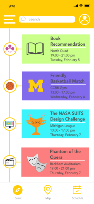
Users can choose to browse the main page either vertically or horizontally, and they can easily search for event keywords and get relevant recommendations.
That page includes lots of event details. Users can register or follow this event as logging in or signing up. The registered or followed event can be easily find at schedule function.


Discover Events Visually
Scheduled Events
When users select present events on the map, they can choose a filter either by target events or by time to get a visual location.
It includes both registered and followed events, and it will remind users of the most recent event. It also allows users to add events to google calendar.
Design Process

Research
Interview and Insights
To understand user behavior and needs with discovering orientation events, I interviewed four students, three of them were the first-year students who experienced orientation and one of them was an upcoming new graduate.
-
“I don’t know where I can find these events.”
-
“I am not familiar with campus and buildings, and I cannot find the right place.”
-
“There are lots of events during orientation week, but I want to attend those that I am interested in.”
-
“I misremembered the event time.”
Insights from interview:
-
Hard to find places for events due to the unfamiliarity with the campus.
-
Cannot find interesting events because of the lack of information.
-
Don’t know which platform from school could be used to explore orientation events.
Comparative analysis and Insights

Insights from Comparative analysis:
-
Even though University of Michigan offers different platforms for students to discover events on campus, there doesn’t exist one focusing on helping students explore orientation events that fit their interests.
User Needs
-
Discover orientation events easily.
-
To be familiar with campus environment quickly.
-
Find out events that match users’ interests.
-
Know event schedules and can be notified.
Ideation
Brainstorming
Below are some design opportunities that could help satisfy users’ needs.

Discover orientation events

Display location visually


Take participation in interested events
Key Sketches and solutions

Use preferences to choose events
Have an introduction about school/university

Highlight events with marks and colors
Browse events on different types horizontally


Show event details
Use map to display and locate events
Save registered & followed events
Design Development
Paper Prototype and User Test
I conducted three usability tests with paper prototyping and received useful feedback from users.

Pre-Explore

Schedule

Homepage

Map
-
Should have “feature,” but didn’t include in this lo-fi prototype: no university can be chosen at the beginning.
-
User’s feeling: complicated steps to start/ too many puzzling features in start steps.
-
User preference: some prefer to browse vertically and some horizontally.
-
User suggestion: google calendar could offer great help for recording schedule.
Wireframe
Based on generated solutions and paper prototyping and testing, I created a wireframe below.

Pre-Explore
Two way to browse the homepage
Search
Search Result
Event Detail
Map
Schedule
Final Design
Interactive Prototype


Pre-explore Events
Users will start with choosing a university. Then to better display events information to users later, they can also select event types based on preference.
Explore Events
Users can choose to browse the main page either vertically or horizontally with personal choice. These events are highlighted by colors and marks and labeled in time sequence. Users can change preferences in the setting.


Search for Events
Users can easily search for event keywords in the search box and get relevant recommendations.


Event Details
Log in or Sign up
On the page about event details, users can check event name, introduction, location, sharing link, etc. It requires users to log in or sign up when users want to register or follow an event. It can also be shared with a friend who might want to join the same occasion. After users register or follow one event, it will be recorded by schedule function.


Discover Events Visually
When users select present events on map, they can choose a filter either by target events or by time to get a visual location.
Scheduled Events
It includes both registered and followed events, and it will remind users of the most recent event. It also allows users to add events to google calendar.


Visual Design
Reflection
Next step
Below are some additional evaluations about this orientation events experience.
Question: Is this design only for students?
Answer: University organizer could also use to regulate and add events there.
Solution: Users could choose to log in as a student or an organizer.
Question: What else could an orientation app be used for?
Answer: Users may wish to make friends with who share similar hobbies.
Solution: Could create a group chat with students who take participate in the same event. Therefore, students could interact with each other.
Sketches are some ideas that might solve problems instead of a specific interface layout.
When I sketched possible solutions, I have described roughly the interface already, which limited my thoughts and creative ideas later. It seemed that I aimed to layout design rather than generating ideas to achieve the project’s goal. I did not realize this issue until I created the digital wireframe, and I suddenly recognized that I have already designed layout on my sketches. Each design process has its effects, and I should do the corresponding works at every step.
Should also pay attention to the color palette
In my visual design, I tried to use different colors to represent each event category, which supposed to express visual hierarchy very well. However, since I all chose bright colors and made them evident on each page, the whole interface looked not very clean and expressed overwhelm messages to users. Visual and UI design should follow some principles as well, such as 60/30/10 rule, which could bring a clear and clean interface and reduce the stress of using it.