What I Learned From Friender
This was my first individual work as a UX/UI designer, and also was the first time I learned interaction design with academic instructions. Even though I learned about design methods, thinking, and process, I still made some common mistakes that I could avoid since I read lots of design-related books and got some useful advice from my graduate assistant instructor.
Should have a clear problem definition
According to my problem statement, it indicated one issue that digital technologies make people less sociable. I did point out the problem that I was trying to solve. However, I didn’t explain why this is a real problem, why it is important to be addressed, who are target users, and what their goals are. For these unanswered questions and lack of narrow scope, my project did not solve problems thoroughly and effectively.
Research is vital and necessary
There are lots of research methods in user experience research, such as literature research, observation, task analysis, interview, survey, competitive analysis and so on. In this project, I only did literature research and competitive analysis, which made research seem not very convincing and not have enough evidence to support my problem statement. For future design, I must pay more attention to the research part to find out the user needs and behavior.
Should identify User Pain Points before generating design ideas
Before generating or brainstorming design ideas, it is crucial to narrow down the target users and identify users’ pain points. Pain points could facilitate designers to create feasible design solutions and solve problems thoroughly. Besides, based on the real pain points, the product could be more satisfied with target users.
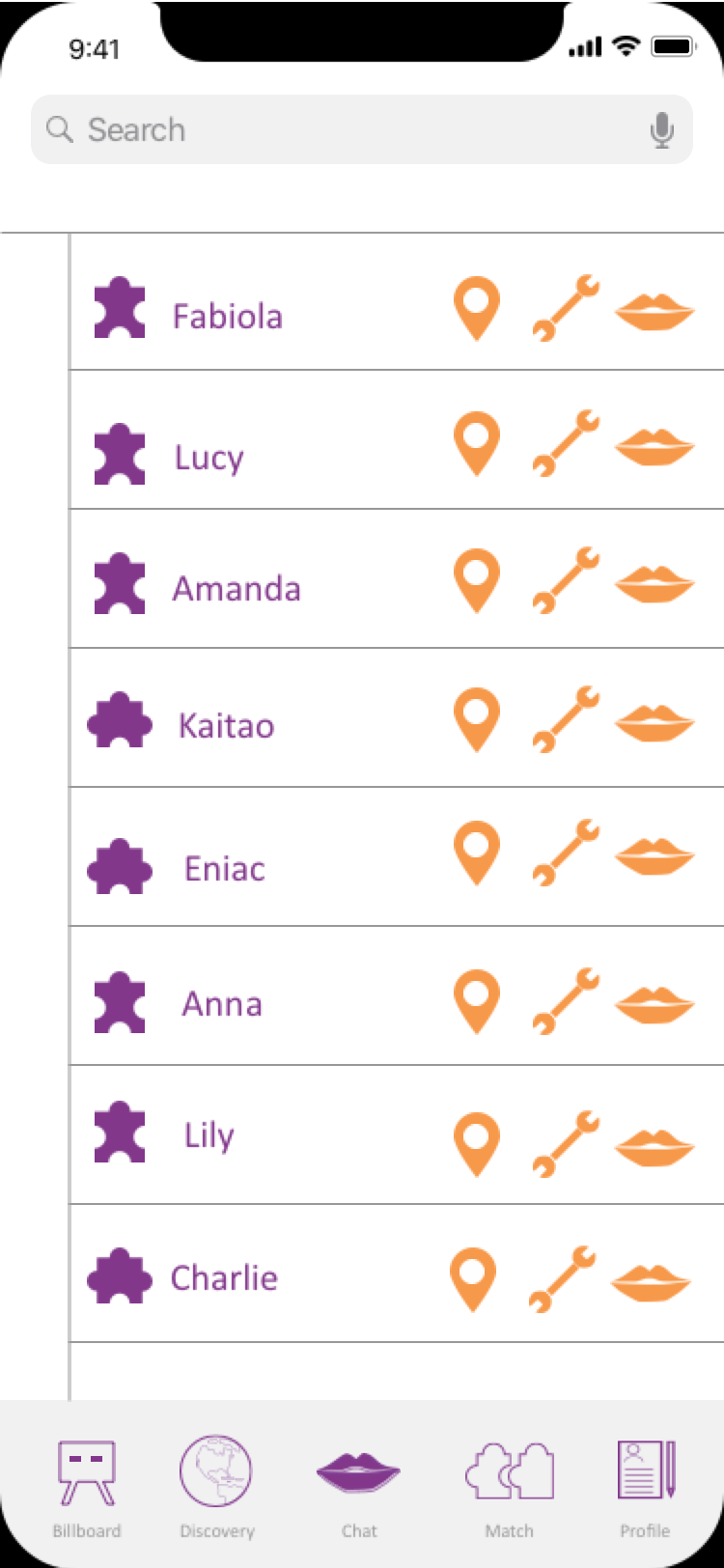
Icons should be consistent and simple
Since this was the individual works, I wanted to show the originality of design. I then designed all icons myself, and some figures seemed very fancy. However, when I did usability tests, users all mentioned that the icons they didn’t look familiar with, and they needed to spend more time identifying the meaning of this icon and explore its functionality. A good design should include creative thought and behavior, but confusing users while using the product is not a good idea.
Design Process

Frame the Problem
Problem Statement
Digital technologies are increasingly popular in our daily life, and users are benefiting from them. But they have no effective way to help individuals know their friends, classmates, coworkers and neighbors better, especially for students or employees who come from other countries or cities without close friends or relatives. It is difficult for them to make good friends only through social media. There is a survey that indicates that while technology offers greater connectivity among people than ever before, it is making people less sociable. Less sociable means harder to make friends in real social life. Most people forget the value of face-to-face interactions to create more crucial and sustainable relationships. It seems that when digital technologies become a salient and irreplaceable part of our daily life, people usually feel more lonely in their deep heart, some people even hide under the digital social media to avoid the actual social world.
User Research
Social Anxiety
Social Isolation
No Interaction in Real Life
Explore the Solution Space
Design Goal
-
Enable students to make friends based on hobbies.
-
Increase face-to-face interactions and communications.
-
Learn more from friends.
Ideation through sketching: 8 possible solutions


Find a Good Solution
Storyboard & Scenarios
Based on the research and the possibility of solutions, I created a storyboard (40 grids) to explore the use case based on real scenarios.


Personas


Refine the solution
Paper Prototype

Sign In

Chat

Billboard

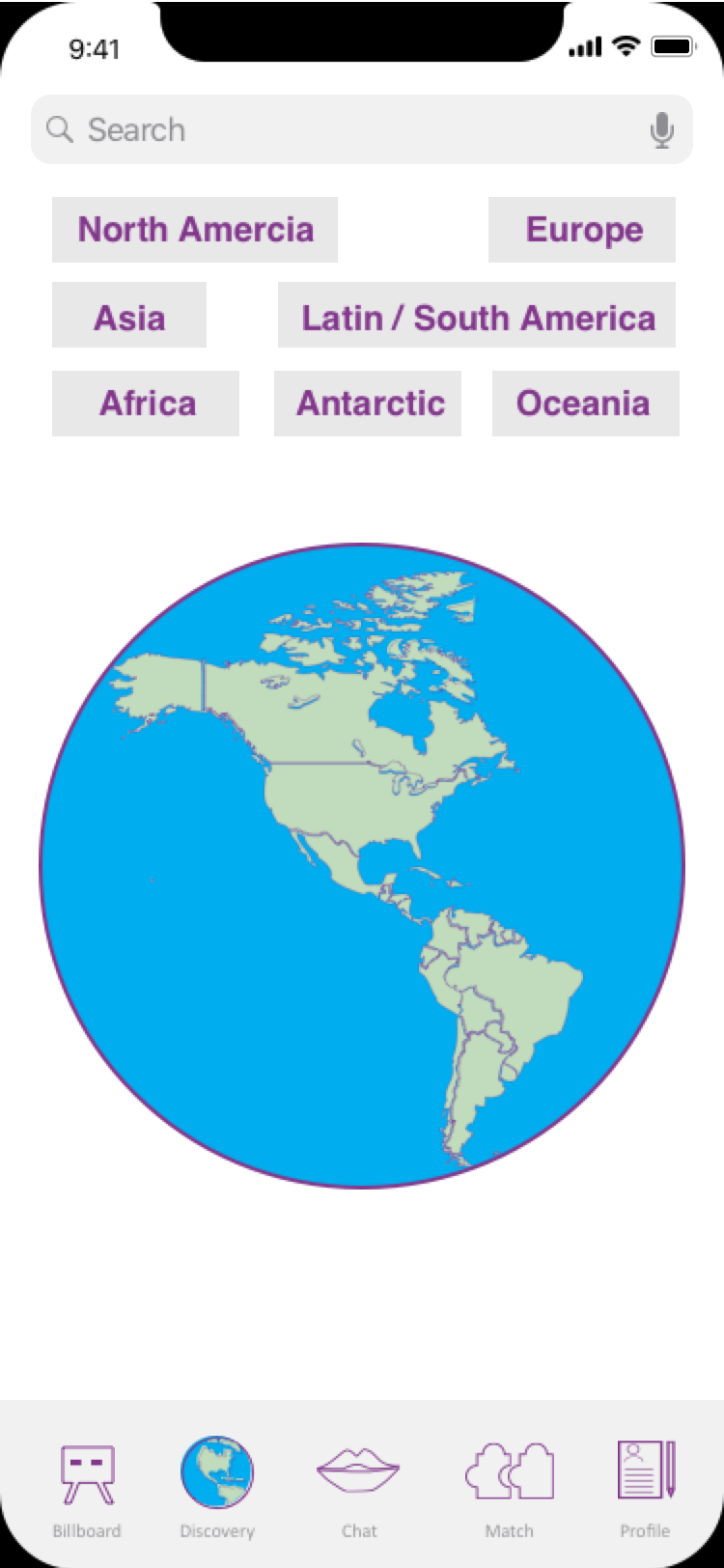
Discover

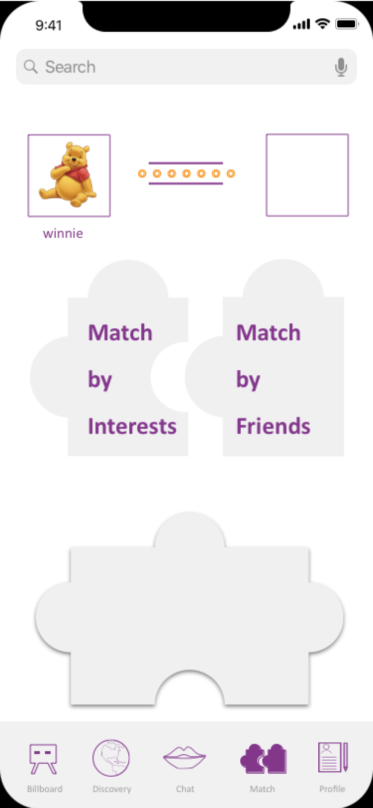
Match

Profile
User Testing
Test possible solutions with focus groups
Main Issues
-
Users would feel a little bit confused about the homepage when they had the first glance.
-
It is hard to figure out so many features and understand what the elements mean.
Changes
-
Added some examples of what a real billboard looks like with many different kinds of post.
-
Added some prompts to guide users.
Digital Prototype
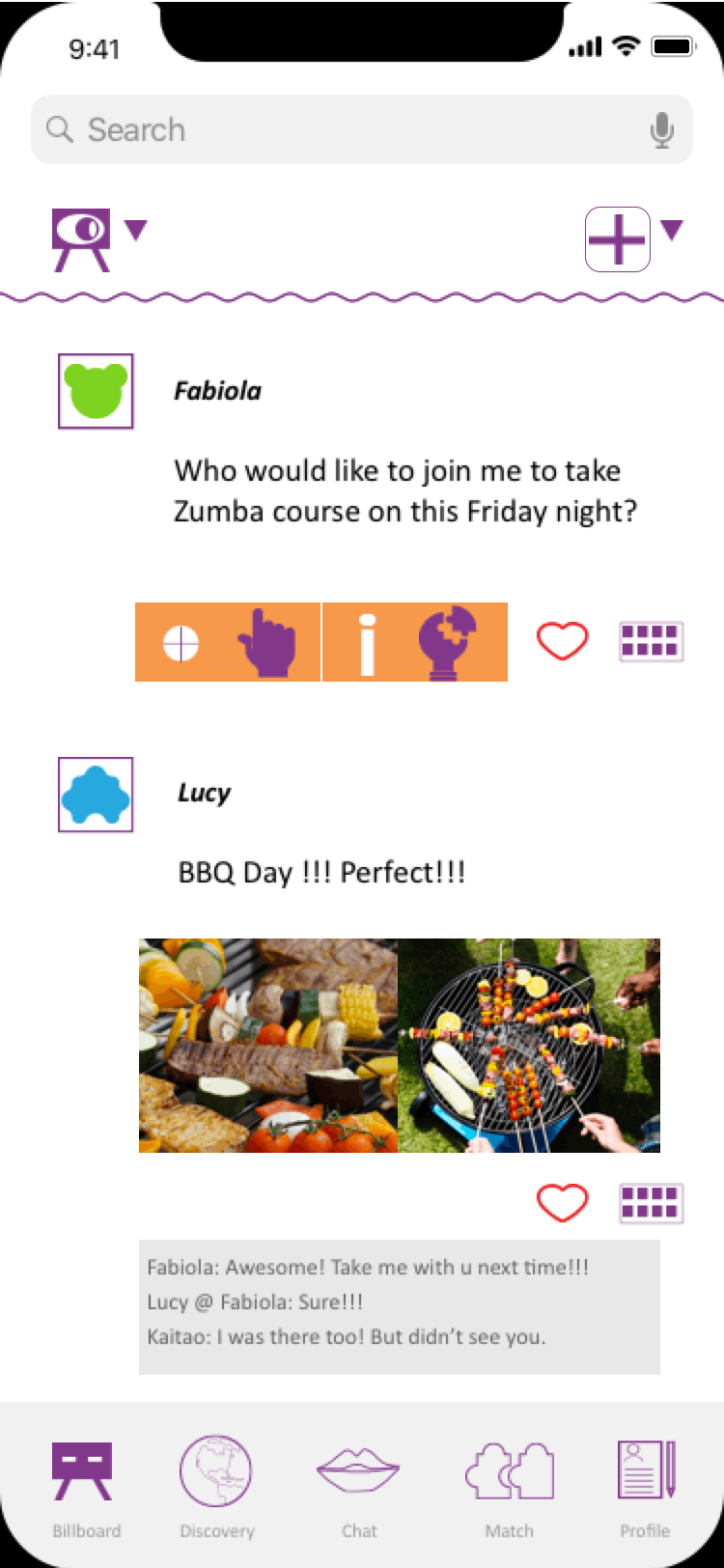
Users use "billboard" to share an invitation of some specific events, its purpose is to invite friends or other persons who see the invitation by chance to take participate in a particular event based on their interests.
Users use “discover” to find their friends from all over the world and also encourage users to gain some knowledge of each city or country through their culture, food, etc.
"Chat" with your friends.
Users use “match” to explore friends who share similar interests so that they could have an upper-level communication or connection with each other. It supports a match with interests or friends.